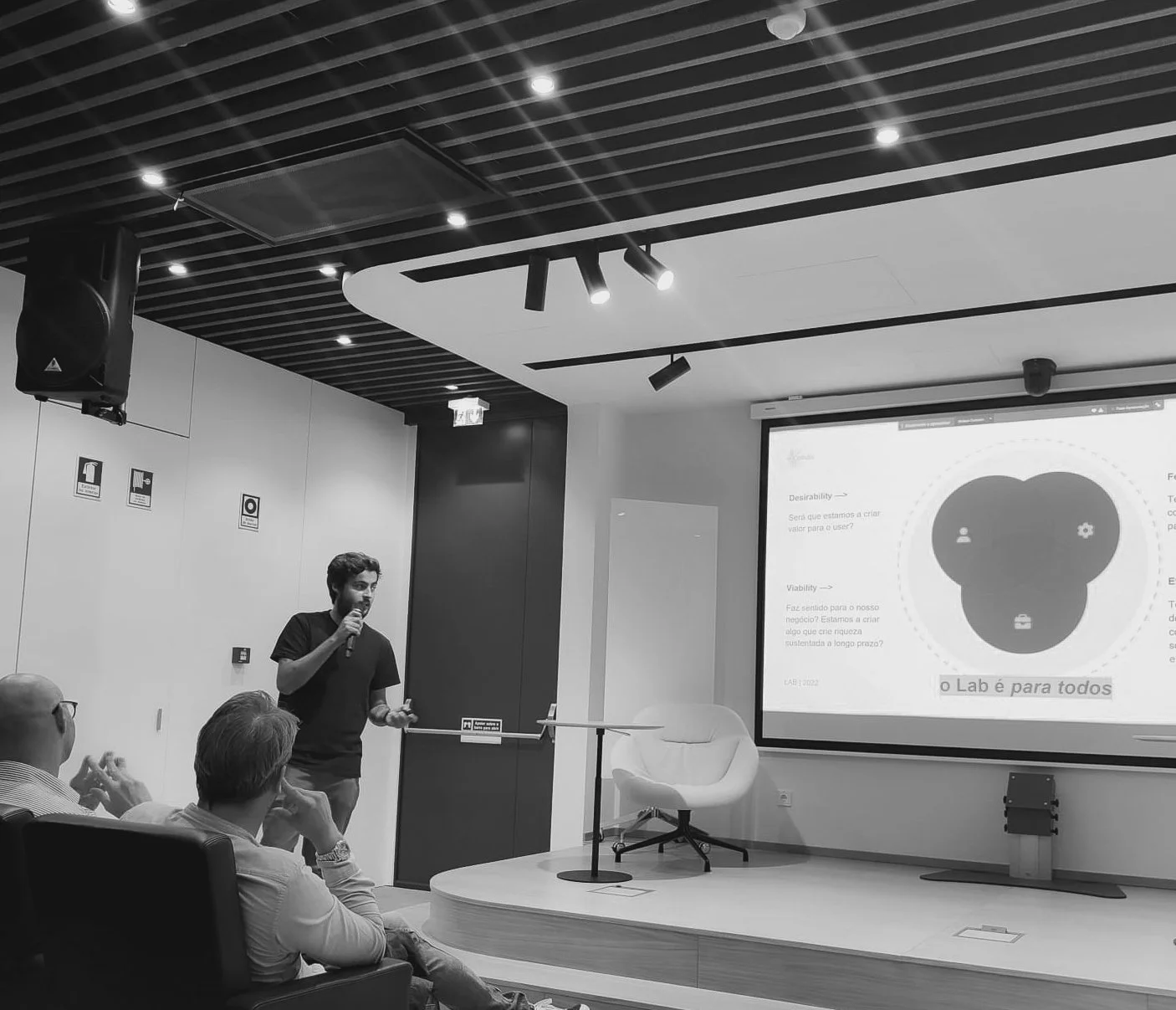
Two men sitting and talking in a modern indoor space with large windows; one of them has a laptop on a small table, and they are reviewing some documents.

A creative problem solver who makes new products, services and visions come true.
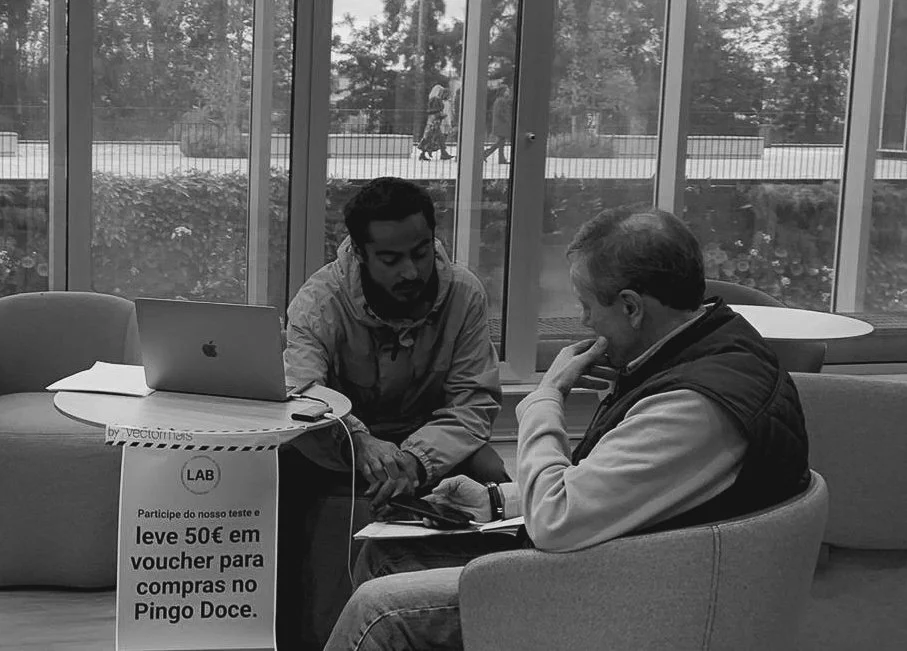
A man giving a presentation in a conference room with a microphone in front of an audience. There is a large screen displaying a slide with a mammoth head diagram and text in Portuguese.

Matheus Leite

Through strong strategic thinking and design skills.

Living on the border, making memories & products.
Close-up of a person wearing sneakers and shorts, standing on a snowboard, with a scenic snowy landscape and mountains in the background.

selected Projects

Secil Group
Strategic Design, 2024

I designed how Secil’s Digital Transformation team explores problems with the people who live them. I built a four-step path, six Miro templates, a playbook and training for Product Owners from the business.
TL;DR

Group Product Manager · 2024–2026 · Secil, Digital Transformation

How an industrial company that buys its software learned to understand a problem before paying for a solution.

The challenge. Product Owners came from the business and often arrived with the answer already in mind. The model had to work for people doing research for the first time, from the plant floor to head office.

Three decisions that shaped it

  • Strategy. I filled the empty discovery step in Secil's product process instead of adding a new one.
  • Model. Four steps, six Miro templates and two research methods, with problem and solution kept apart.
  • Reach. I trained the people who guide the teams, and my fellow GPMs and Scrum Masters took it into their groups.

7 strategic discoveries · 9 product groups · 25+ people trained

Where it stands. Still how a new strategic discovery starts at Secil. The lesson I carry: decide who will carry a way of working before you finish designing it.

Read the full case →

Magic Decks
Business Design, 2024

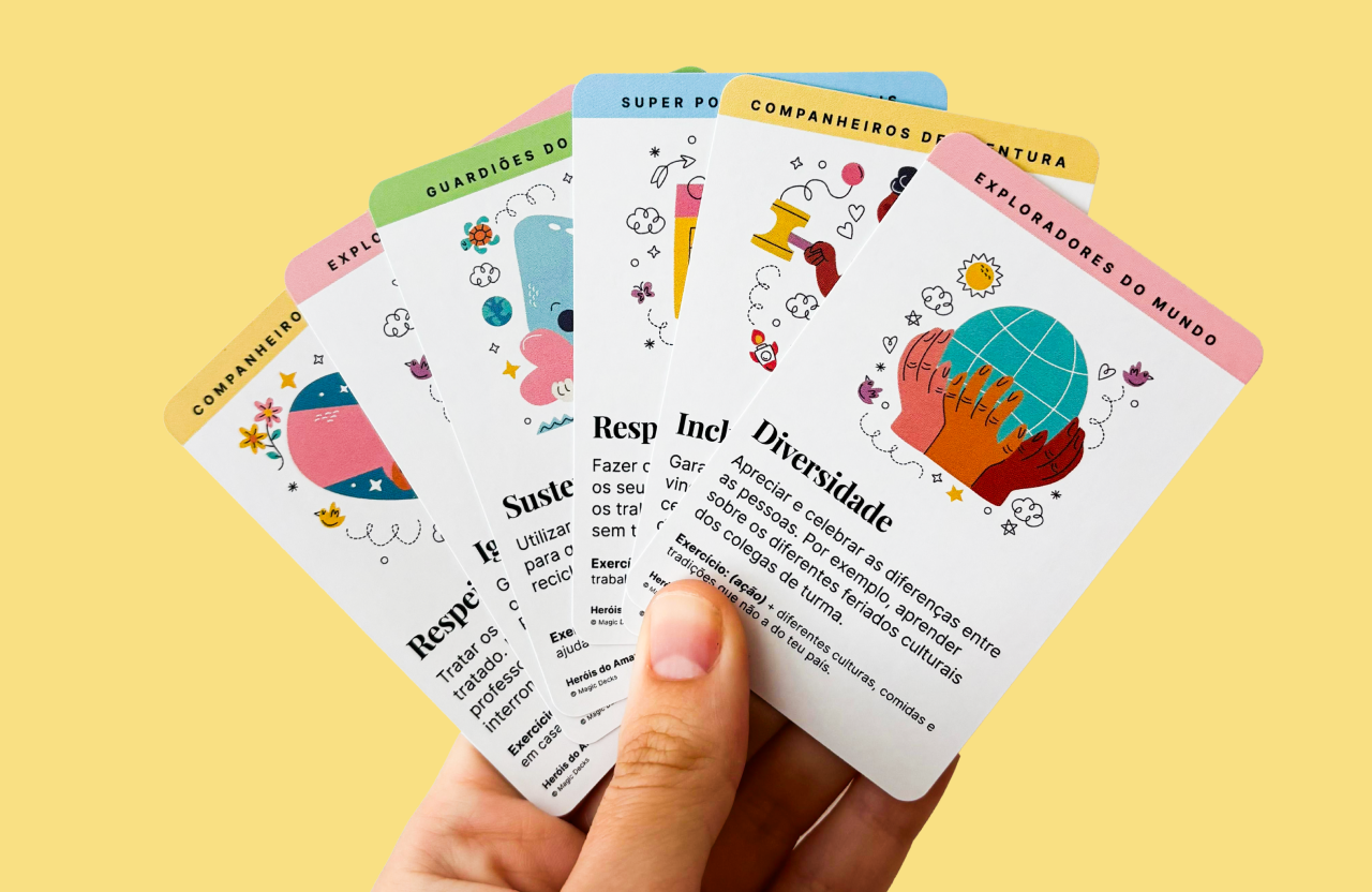
I designed and built Magic Decks, an educational card deck, from zero: the cards, the box, the brand and the store. I made it for mothers, but teachers were the ones who kept it alive. The case covers that wrong assumption and why I stopped while the decks were still in use.
TL;DR

Founder & Creative Director · 2024–2026 · Own venture

A card game that teaches children 48 life skills, built for parents and kept alive by teachers.

The challenge. The adults who teach these skills have little time. The deck had to work in 5 to 10 minutes, with no preparation.

Three decisions that shaped it

  • Product. One fixed card format: a skill, an everyday situation and an open exercise.
  • Experience. I moved the primary buyer from parents to educators and rebuilt every channel around them.
  • Business. I ran the store, ads and operations after my day job, with every number reviewed monthly.

171 decks sold · €127 → €12 to acquire a customer · 4.7× site conversion

Where it stands. Closed in July 2026. The lesson I carry: scale on proof, not on momentum.

Read the full case →

Cofidis Portugal
Product Design, 2023

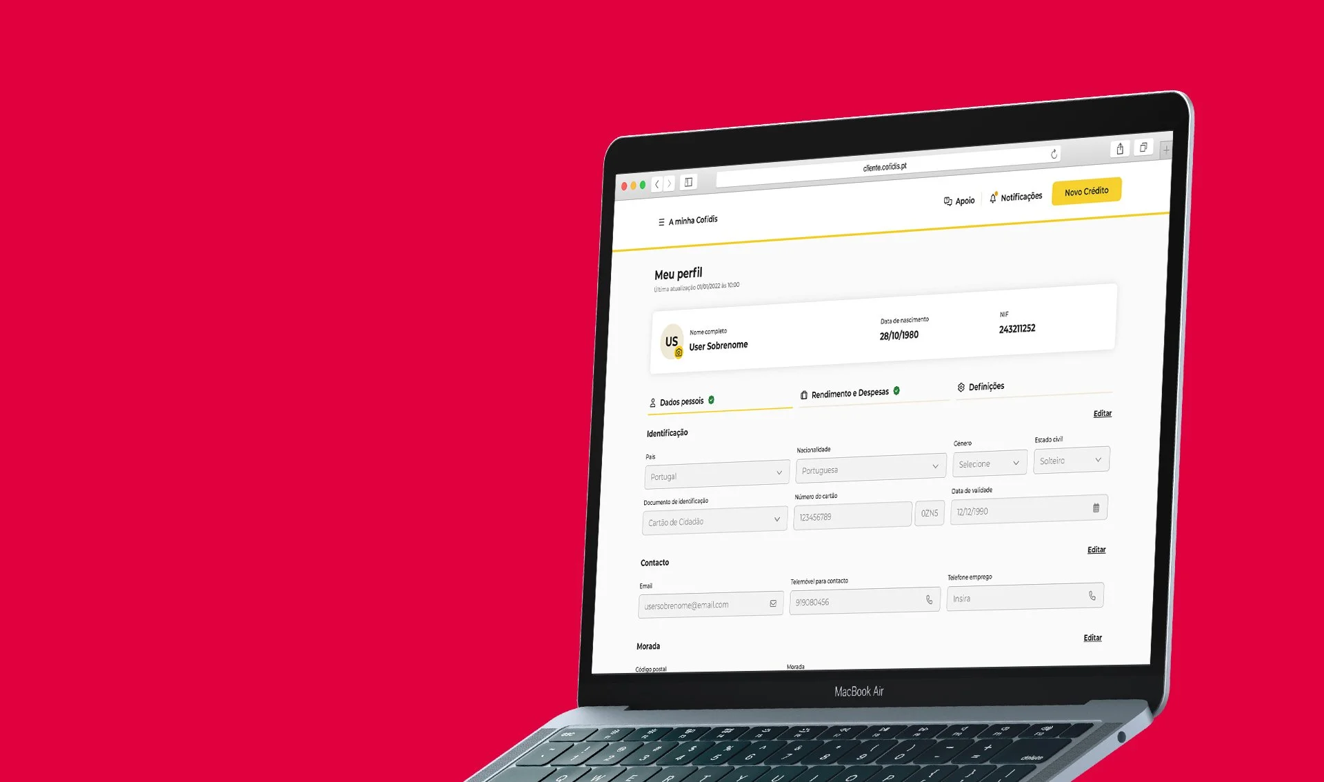
I rebuilt the profile area of Cofidis Portugal’s online banking around how customers group their own data. I ran a card sort with 34 customers and sketch sessions with six areas of the company. The result was one menu, one profile and a support area one click from any page.
TL;DR

Product Designer · 2023 · Cofidis Portugal, Homebanking

An online banking profile area organised the way customers group their own data: who they are, and their money.

The challenge. Customers called support to change data they should have changed on their own. The fix had to happen inside a live, regulated bank.

Three decisions that shaped it

  • Discovery. I asked 34 customers to sort their own data instead of drawing the menu myself.
  • Co-creation. Six areas of the company, from support to architecture, sketched the answers with me.
  • Delivery. One menu, one profile with status badges and support one click from any page.

5 → 1 account pages · 2 → 1 menus · 6 areas involved

Where it stands. Everything designed reached customers, in stages. The lesson I carry: agree the metrics and the starting point on day one.

Read the full case →

Cofidis Portugal LAB
Product Experimentation, 2022

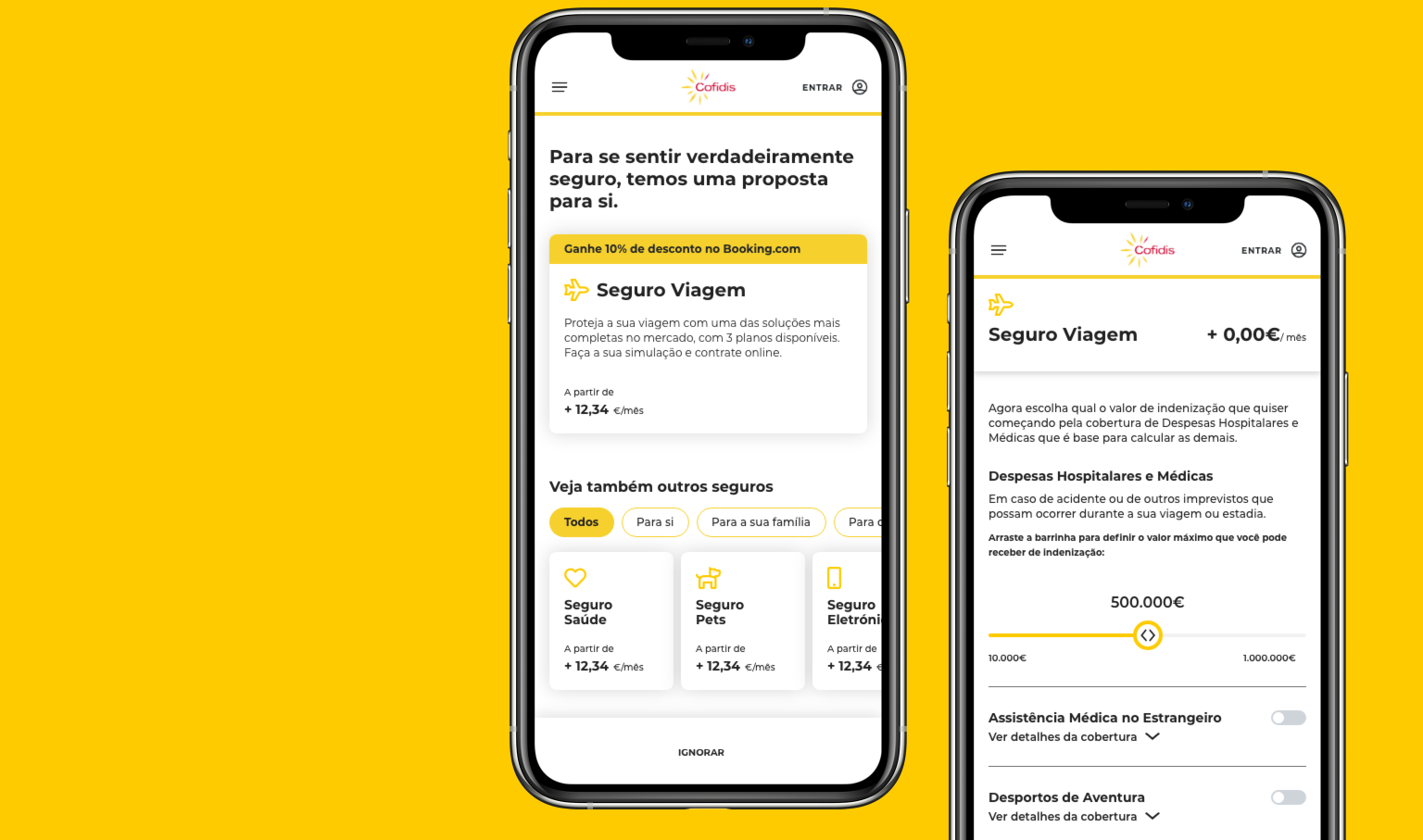
I tested how Cofidis could sell insurance inside its credit request, in a four-week LAB experiment. I ran seven interviews, tested a prototype with customers in the store and sent a fake door test to 1,341 Cofidis Pay customers. Three of four checkout hypotheses held.
TL;DR

Product Designer · 2022 · Cofidis Portugal, LAB

Insurance offered inside a credit request, matched to what the loan is for.

The challenge. Cofidis wanted to sell more insurance, but the offer had to live inside products other teams owned, without slowing down the credit sale.

Three decisions that shaped it

  • Discovery. Seven interviews showed people feared paying for cover they didn't need, so customers could pick a ready plan or build their own.
  • Co-creation. The website and Cofidis Pay teams sketched the concept with me, which opened their products to the test.
  • Delivery. At checkout, the loan's purpose picked the insurance. After purchase, a fake door tested demand.

4 weeks · 3/4 checkout hypotheses validated · 1,341 customers reached

Where it stands. Checkout worked, and demand after purchase stayed open. A year later, Cofidis signed a five-year insurance deal with Ageas. The lesson I carry: put the bar where people commit, not where they click.

Read the full case →

MEDCode
Product Design, 2020

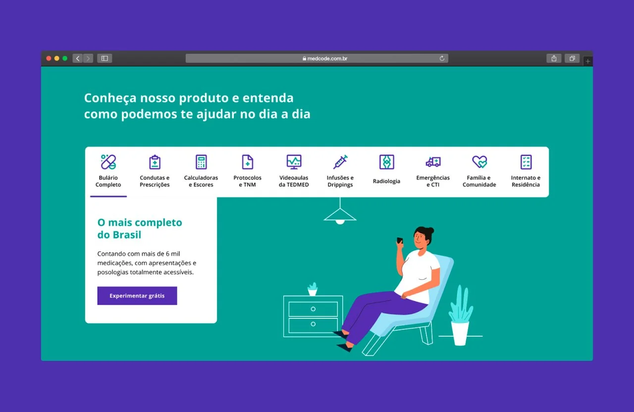
I redesigned the website of MedCode, a Brazilian clinical decision app, to win young doctors from the market leader. I ran a remote discovery with six founders and partners and designed the site from scratch. After launch, MedCode hired me to redesign the entire app.

TL;DR

Product Designer · 2020 · MedCode, freelance

A website for a clinical decision app that had to win young doctors from the market leader.

The challenge. The founders said the site was bad for conversion and bad to look at, and feared a custom build would drag. It had to look like no one else and still be quick to build.

Three decisions that shaped it

  • Discovery. An async form, answered by six founders and partners between shifts, turned the brief into one job: show why MedCode instead of Whitebook.
  • Build. No template. I answered the fear of delay with a small system and clear specs for the developer.
  • Outcome. The comparison answered first, and the annual plan pushed over month-to-month.

5 weeks · 11 → 1 component · 1 → 2 projects

Where it stands. Live in 2020, then MedCode hired me to redesign the entire app and portal. The lesson I carry: test the bet before you hand it over.

Read the full case →